Browser compatibility has always been an issue for web developers, specifically in recent times. Maybe due to an ever-increasing size of CSS library with newer frequent additions. Or because of the browser rules that prohibit certain properties from flourishing to their maximum extent.
Browser compatibility issues in CSS are not only a burden for web developers but the browser developers too. This allowed browser compatibility testing to take a new shape in the past decade, with tools emerging around the globe with a larger emphasis on cloud testing to solve this problem.
This post is the direct result of the latest MDN survey that highlighted the various aspects of web development, including browser compatibility.
In addition to studying the above-given survey, Google has also focused on the Google Developer Satisfaction project and StateofJS survey results. This project works on the needs of the web developers and identifies what problems the web developers are facing.
Combining these studies, Google has found out top five cross-browser compatibility issues in CSS that they will be working on in 2021. These are:
CSS Flexbox.
CSS Grids.
CSS position: sticky.
CSS aspect-ratio.
CSS transforms.
This project is termed Compat2021 which is probably short for “compatibility 2021”. All five of these properties are extremely popular and used extensively in web application development. Therefore, Google has collaborated with Microsoft and Igalia to divide this work and proceed faster.
This decision also became one of the annual highlights, as evident by the following headline:
](https://cdn-images-1.medium.com/max/3098/1*HWnC9txP5O-TviihVQqgWQ.png)
Microsoft has taken the responsibility to improve Chromium with respect to CSS grids and subgrids and aims at passing 100% of the grid tests in 2021. The test results will be available on the web-platform-dashboard for CSS grids.
Similarly, the Compat2021 dashboard was brought up to show the current test scores and the leading areas of browser compatibility. Currently, it looks as follows:
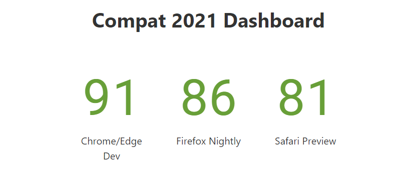
It shows that Chromium browsers Google Chrome and Microsoft Edge are currently leading, with Mozilla Firefox and Safari a little behind. Not to mention, the work is underway to push them ahead.
This post is dedicated to observing these five focus areas pledged by the tech giants to be resolved by the end of 2021. By the end of this post, we hope to answer the questions such as what are the major problems in each of them? Where are we progressing? Why are these problems hindering browser compatibility issues in CSS? and how to solve browser compatibility issues?
Hey! Are you interested in knowing the browser compatibility of ch (character) unit? It shows a browser compatibility score of 93. ch-unit is a unit representing the width of the character “0” in the current font. This can be used with monospace fonts to help align content across columns, tables, and fields.
CSS Flexbox
The first in the list of top browser compatibility issues in CSS is the Flexbox. One of the troublesome and most critical areas to be under the radar of Compat21. CSS Flexbox is known for playing a significant part in small to large projects because of the versatility and the ease by which it creates a container and fills the items inside it. It was involved in 3 out of 4 page loads on the internet as of June 1, 2021.
Igalia has shown a lot of support in fixing out the issues arising in the CSS flexbox and has already been able to fix a lot of them, which are constantly included in the Chromium updates this year.
The issues being passed by the browser tests through various browsers expanding up to 1098 tests have reached a score of 18/20 six months into this year. Bottom line: the changes have been highly successful with a high pass percentage.
The major problem in CSS flexbox has been the height and width problem (or aspect ratio to be precise) while dealing with the images inside a flexbox. Therefore, if you are unaware of the concept, development, and basics of CSS flexbox, it is recommended to learn them before understanding the code in this section.
One of the primary problems in focus is the auto-height adjustment in the CSS flexbox when we are dealing with images as items inside the containers. Consider the following code defining a height for the flexbox:
<html lang="en" dir="ltr">
        <head>
          <meta charset="utf-8">
          <title>Flexbox auto-height</title>
          <style>
              .item > * {
                display: flex;
                padding: 10px;
                height: 300px;
                flex-direction: column;
                align-items: flex-start;
                justify-content: flex-start;
              }

    </style>
        </head>

    <body>
        <div class = "flexbox">
          <div class = "item">
            <img src = "cat.jpg" />
          </div>

    </div>
        </body>
      </html>
This would bring the output like this:

Declining any adjustments to the aspect ratio based on the height we defined! However, this has been resolved now but has been a critical pain point for developers. The below tweet highlights the satisfaction among the developers for fixing up the Flexbox issues:
Apart from images, CSS flexbox has raised issues on the alignment of the items on various scales and elements. One of the unresolved issues has been the visibility: collapse not working for the Blink engine. But the major pain point with CSS flexbox remains to be the aspect-ratio of the flex items.
CSS Grids
CSS Grids, just like Flexbox, is a very popular CSS element used in web designing and perhaps, is used more than flexbox. CSS grids use a grid structure to fit elements inside them and apply various properties according to the requirement. With their flexible nature and the purpose of their existence, they have become the building blocks of web design.
To learn more about their working and construction, please refer to CSS Grids and It’s Implementation. As of May 2021, CSS Grids are detected in more than 92% of all the page loads, which is extremely high.
](https://cdn-images-1.medium.com/max/2000/1*POIhnBJ2HPR2iaNIy07s8A.png)
With such a high involvement in web design, CSS grids are the top priority of Compat21. Currently, CSS grids have generated the highest score in passing the Chromium engine tests among the five browser compatibility issues. A symbol that this property would be stabilized for the current version globally.
As mentioned above, the Microsoft Edge team has taken CSS grid responsibility, and they are working to reduce the gaps between features that CSS grids can perform in some browsers but not in others. One such feature is animated grids which work perfectly in the Gecko engine of Mozilla but not on Chromium and Webkit.
Animation grid example:
](https://cdn-images-1.medium.com/max/2520/1*OT5EyGYKjF3-iuxmB1bweQ.gif)
Microsoft Edge is working on rearchitecting the engine so that it can support subgrids too. Subgrids are also a controversial part of web design which will hopefully be resolved for Chromium by the end of this year.
Microsoft is working on the LayoutNG engine that will clear out all the issues in CSS grids (including the animating grids) and the subgrids. Apart from this, there have been a few bugs logged in CSS grids, but they have been rectified, and no serious issue persists. The rest we will know once more engine updates roll out!
Hey! Did you know? The CSS appearance property allows developers to change the default styles for web user interfaces. For example, by setting the value to none, it allows developers to redefine the look entirely using CSS properties.
CSS position: sticky
CSS position: sticky is the third browser compatibility issue in CSS and was decided by the survey results to work on in Compat21. The CSS position: sticky is used to fix the element to the viewport even if we are scrolling. The most popular use case is to use it for the navigation bar on the top of the screen, even if we are scrolling.

The above picture fixes the image to the viewport even if the scroll event is under place. This might not bring out the best from the web page but still serves its purpose :).
CSS position: sticky for normal elements such as headers and navigation bars that load up with the web page works fine with Chromium and other browsers. The output is also consistent across various browsers, and browser compatibility issues are rare.
The problems in CSS position: sticky sometimes is when used within other elements such as table headers. This does not work in Chromium. While you can enable this with the flag option, it still shows inconsistencies across the browsers.
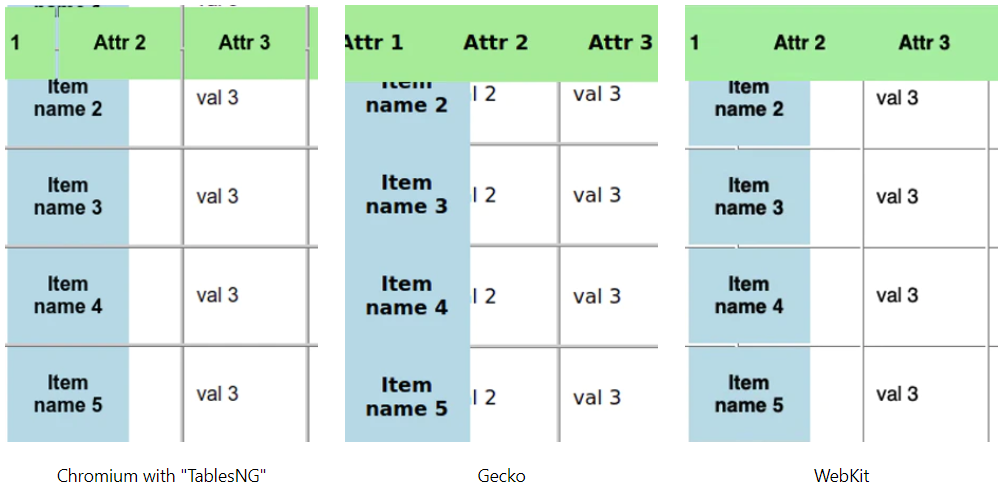
However, the Chromium bug 702927 details that the sticky position was working fine with the “td” tag. However, the real problem persists with the “thead” (table head) and the “tr” (table row). A similar bug was filed for the Gecko engine as 975644 and with Microsoft Edge as well.
There can be any use case in CSS position: sticky value that can raise the browser compatibility issues. For example, a use case I got from MDN was in Microsoft Edge regarding sticking the video to the viewport that was flickering in the Edge browser.
Overall, CSS position: sticky is performing great with Chromium and Gecko, whereas some issues are still unresolved with Safari. Specific to the browsers, Google Chrome has passed all the tests currently logged for Compat21, and a score of 20/20 is generated for the browser.
CSS aspect-ratio property
The aspect-ratio property in CSS is a big reliever when dealing with content with high dimensions, such as high-quality images. CSS “aspect-ratio” sheds off the load from the web developer for calculating the perfect combination of height and width for the image.
If you are new to the concept of CSS aspect-ratio property, it is recommended to learn about the concept before moving ahead in this section.
 img {
        aspect-ratio: 1/1;
        height: 500px;
      }
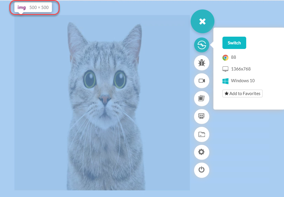
For a new property like CSS aspect ratio, which has become quite popular, issues are bound to happen. However, the browser developers are keen to quickly clean all the mess before it piles up a couple of years later.
Although we cannot clearly state any common problem as we did in the above sections, we know that the CSS aspect-ratio property is the winner in the overall scores generated based on the tests for all the major browsers (considering combined score). Scoring 19/20 for the Chromium section, developers are excited to guarantee that it probably won’t raise any browser compatibility issues in CSS when using the aspect-ratio property.
CSS Transforms
The final property shortlisted in the list of browser compatibility issues in CSS is the CSS transform property. The transform property helps in the animation of different elements on the web page. These animations are achieved through four properties viz. Skew, scale, translate and rotate.
CSS transforms have been used for quite some time in CSS, and if you are unaware of its implementations, you can learn in-depth about it in A complete guide to CSS transforms.

The CSS transform has the lowest score on the Compat21 dashboard in all the browsers, scoring just 15/20 in Chromium, 14/20 for Firefox, and 13/20 for Safari.
As per Google’s concerns, they have mentioned the card flip effect as one of the CSS transforms problems that need quick attention.
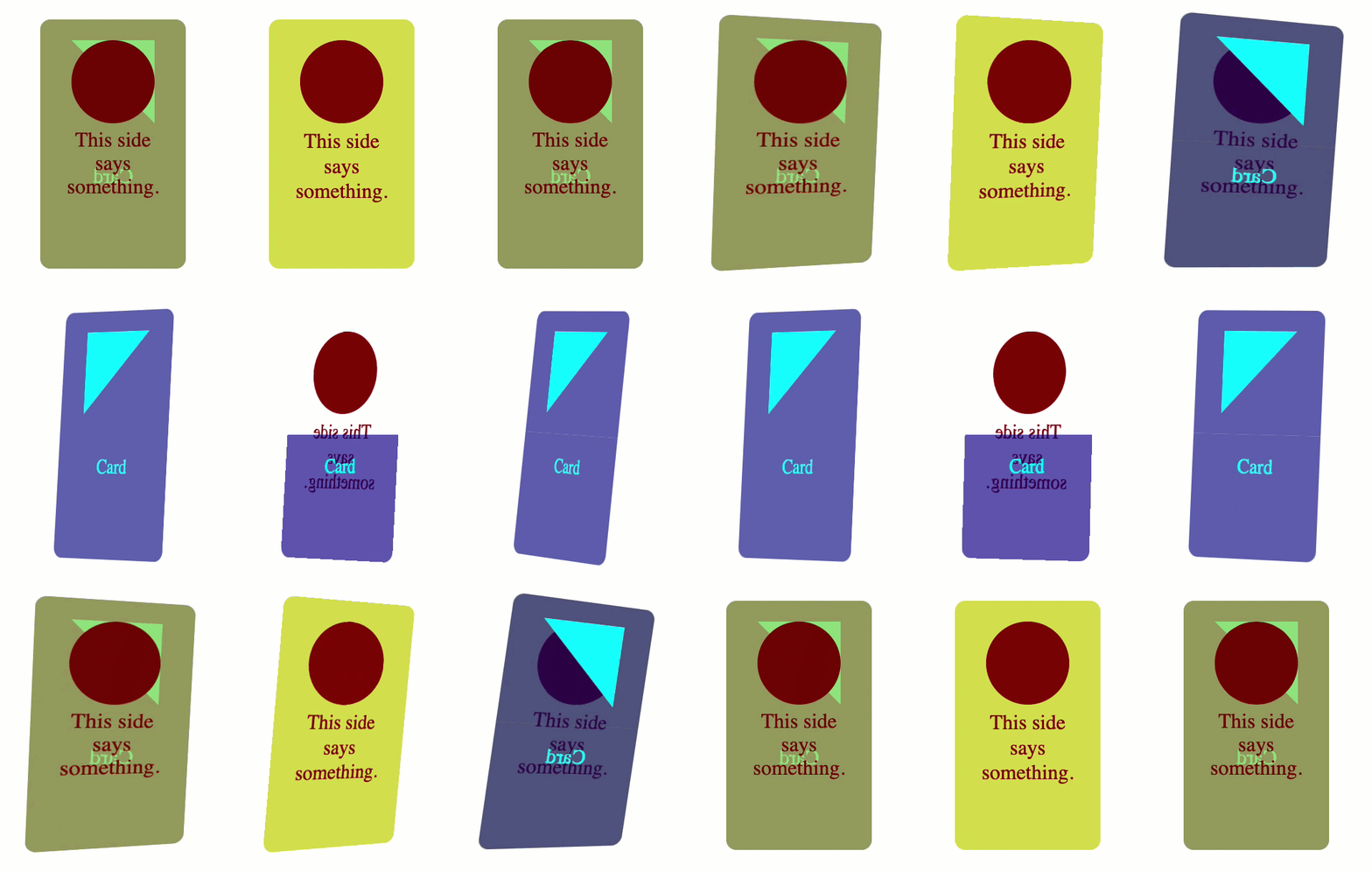
Card flip effect showing inconsistencies in three different browsers.
But, in the recent tests, I have noticed a lot more problems in 3D transformations, and most of them don’t work on any of the browsers. So, while developing a transform, you might think that this is not a feature, but it is not supported by browsers. The latest bugs are issues on SVG transformations and their rotations as well. For example, bug issue 1175179 talks about the SVG transforms and the browser compatibility issues it is raising.
The overall test pass percentage has been just 55% for CSS transforms, which is the lowest in all the pain points. Not to mention, CSS transforms have a long way to go!
How to solve browser compatibility issues in CSS?
Browser compatibility issues in CSS are not a new thing! Maybe they had gained some special attention in the past few years but have been into the system long back when internet explorers and Netscape were there.
Honestly, I believe they will always exist in the system as long as CSS is growing, web developers are experimenting and creating wonderful solutions on the web. However, today, they need special attention when browser compatibility issues in CSS are something we cannot ignore.
If something is working on your system does not mean it works on all of them. Therefore, rendering your website on major browsers will help your business and the community find those hidden flaws.
You don’t need to install multiple browsers for such processes. Cross browser testing platforms like LambdaTest support 2000+ browsers and browser combinations across different platforms and operating systems on the cloud.
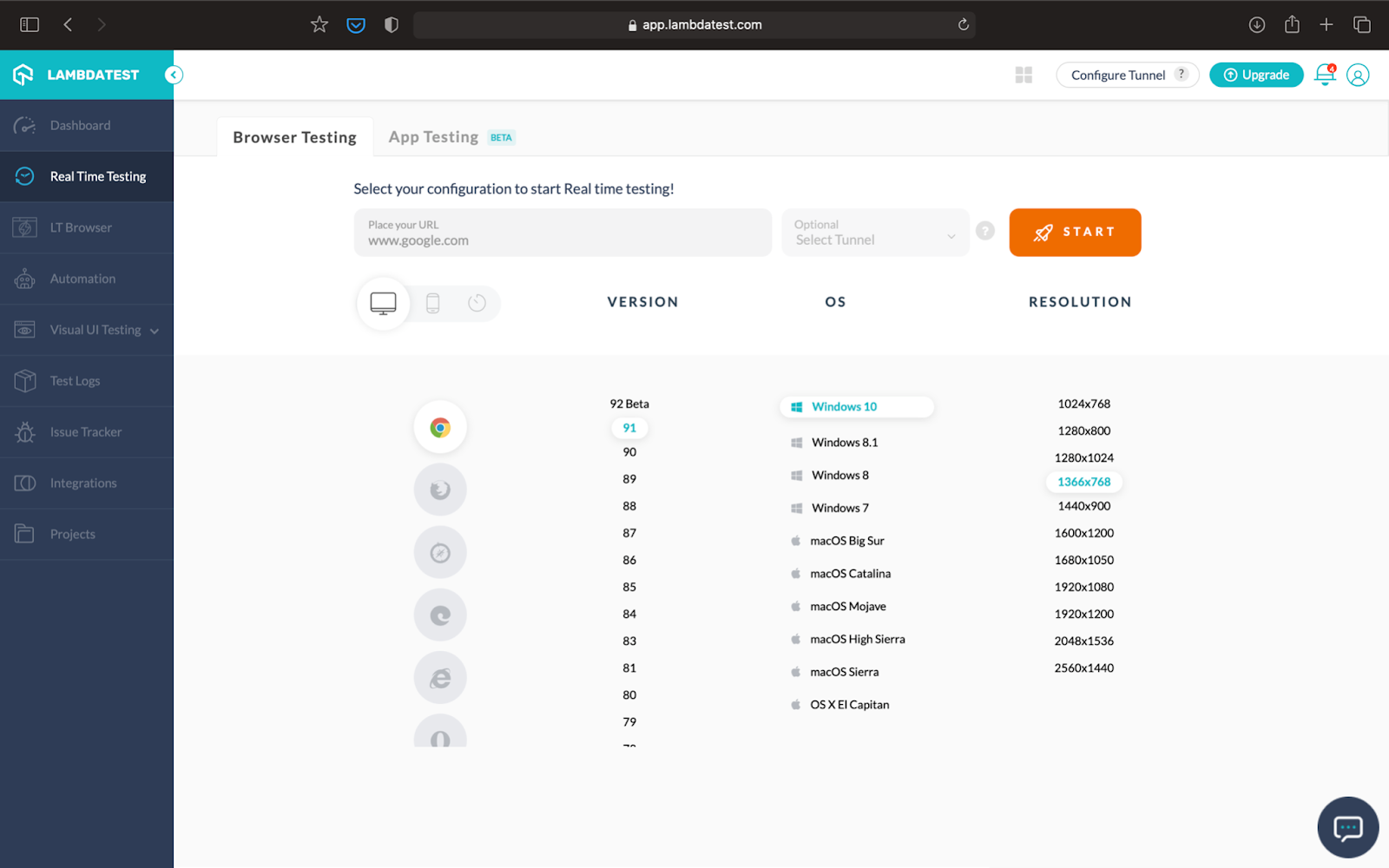
All you have to do is turn in the URL and select the browser/device combinations based on your target market and explore the nuances of CSS within seconds. In addition, LambdaTest allows you to perform browser compatibility testing on locally hosted web applications for the unpublished website or under-development website. So we can create a CSS grid and focus on that specific Grid on various browsers rather than analyzing the completed website as more elements can distract us from minor bugs.
Did you know what CSS Animation is? It is a method for animating the transition of certain properties of an element.
Wrapping it Up!
If you see a bug after performing browser compatibility testing and are unsure about its origins and how to solve it, a good practice is to raise those bugs and let the experts handle them. If the bug is a potential flaw in the system, it will be considered for the Compat21 and will improve the browser engines and the overall browser compatibility of the system. You can raise your bugs from the feedback section of the browser or directly on the Chromium, Webkit, or Gecko. You can also keep an eye on the Compat21 dashboard to know about the improvements. I hope this article helps you in tackling browser compatibility issues in CSS! For any queries and suggestions, comment on the post and let us know!
