![CSS Position Sticky Tutorial With Examples[Complete Guide]](https://cdn.hashnode.com/res/hashnode/image/upload/v1655820099721/txlShNjEi.jpg?w=1600&h=840&fit=crop&crop=entropy&auto=compress,format&format=webp)


Table of contents
- Need For Position Sticky In CSS
- CSS Position And Its Values
- What is CSS Position Sticky?
- How To Create A Position Sticky Element Using CSS?
- How To Design A CSS Sticky Header?
- How To Design A Sticky Footer In CSS?
- How To Design A Sticky Image In CSS?
- How To Design A Sticky Navigation Bar In CSS?
- Special Case With CSS Position Sticky
- Precedence In CSS Position Sticky
- Accessibility Issues With CSS Position Sticky
- Cross Browser Compatibility For CSS Position Sticky
- Why Don’t We Use CSS Position Sticky That Much?
- How To Run CSS Position Sticky On Internet Explorer?
- Conclusion
Seven to eight years back, CSS developers brought a fifth child into the positioning element world. The name of this element was “sticky” because all it does is get ‘stick’ to the viewport and just be in your sight (depending on the developer though). Although the sticky property of an element gives a name to a particular property in CSS, it does not bring anything ‘new” to the table. If I say, “let’s use a sticky div box,” you know what I am talking about, but before its release people would just define what they wanted to do like “Can I have a div box that would always be visible or available even if the people are scrolling?”
The entire point of bringing this up is to tell you that stickiness existed in web development long before it was introduced as a standard in CSS. This post will dive into the CSS position sticky, and we will find out how to get the CSS position fixed. Before we do that, let’s briefly see how people used the position sticky property before its official release.
Hey! Did you know? The dialog component lets you display messages to users in a modal or non-modal manner, easily. It’s great for alerting users of errors or displaying notification messages to the user.
Need For Position Sticky In CSS
As I mentioned, the position sticky in CSS was used even before it came out as a standard in CSS. So, why did they introduce it when everything was working fine?
Apart from CSS, the stickiness can be achieved through JavaScript also. In JavaScript, we make the use of scroll event handlers and calculate the offset of the page. With these values, we make calculations to stick the element as soon as the offset reaches a point. This used to work earlier, but for the last eight-nine years, scroll handlers became a total mess when better graphics were introduced in the systems.
The problem with scroll handlers is that unlike CSS, it relies on the CPU for doing its job. On the other hand, CSS uses hardware acceleration (a standard on all the browsers now for better cross browser compatibility), which means it relies on the GPU for doing its job. Due to this, we would often see the UI of the website, breaking down quickly when the sticky element is coded in JavaScript. A better solution to this is bringing the stickiness to the GPU. The only way to do that is by introducing it as a standard in CSS. Looking back, it actually makes a lot of sense. So, the “sticky” property was added to the positions which already had four values. To understand how to get “CSS position fixed,” we should know the behavior of other CSS values.
CSS Position And Its Values
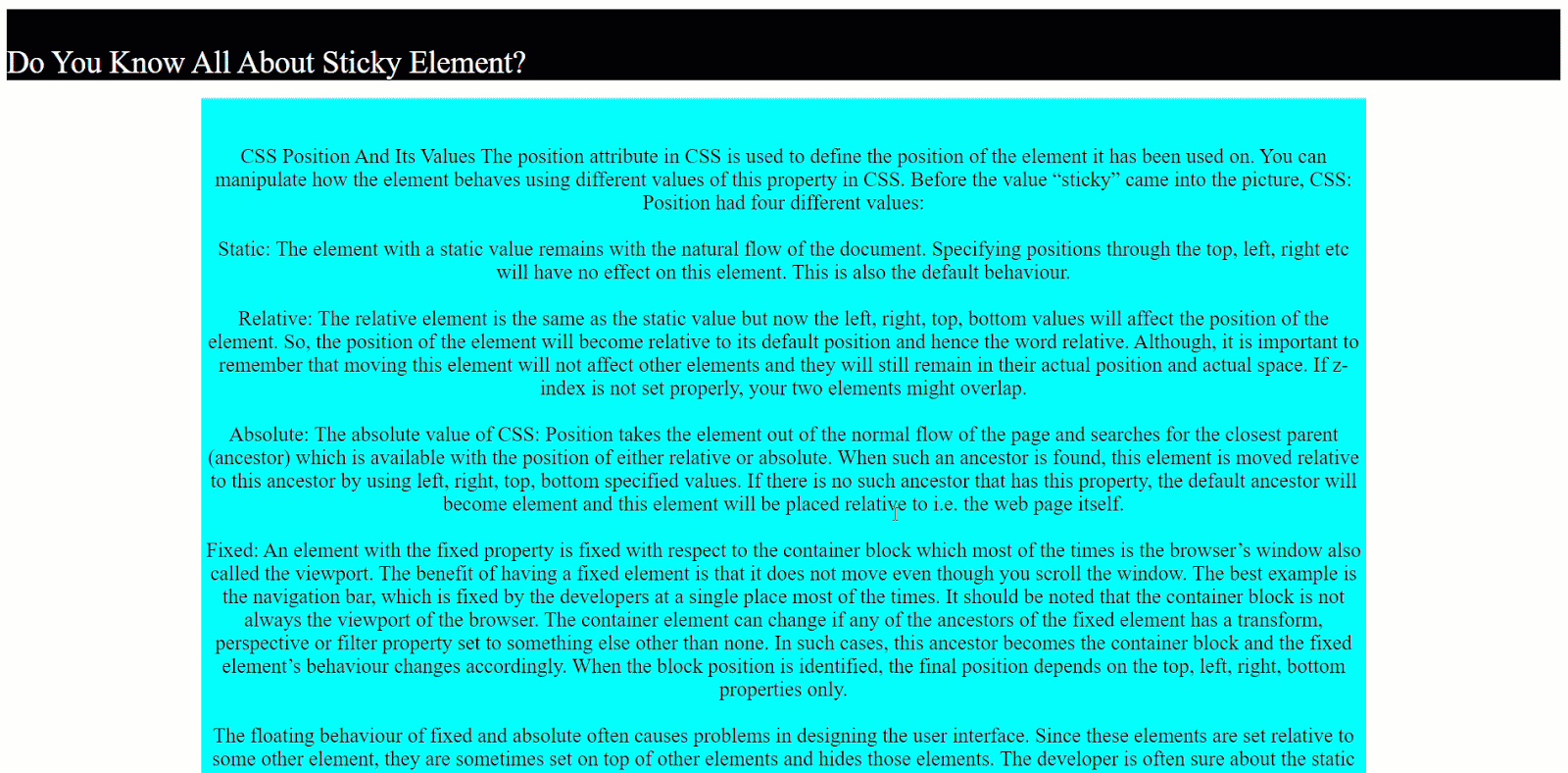
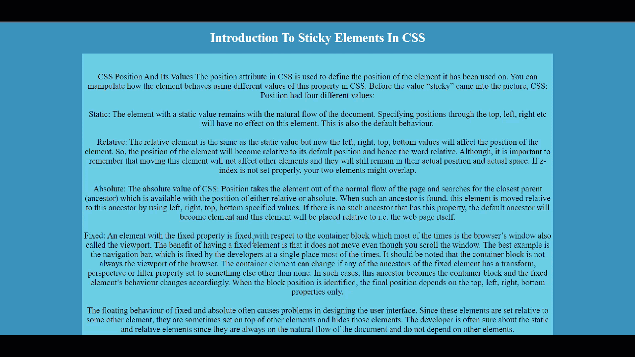
The position attribute in CSS is used to define the position of the element used in the browser window. With CSS position fixed, you can manipulate how the element behaves using different values of this property. Before the value “sticky” came into the picture, CSS: Position had four different values:
Static: The element with a static value remains with the natural flow of the document. Specifying positions through the top, left, right, etc., will not affect this element. This is also the default behavior of an element in HTML.
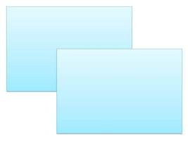
Relative: The relative value is the same as the static value but now the left, right, top, bottom values will affect the position of the element. So, the position of the element will become relative to its default position and hence the word relative. Although, it is important to remember that moving this element will not affect other elements and they will still remain in their actual position and actual space. If z-index is not set properly, your two elements might overlap like this:
Absolute: The absolute value of CSS: Position takes the element out of the normal flow of the page and searches for the closest parent (ancestor) which is available with the position set to either relative or absolute. When such an ancestor is found, this element is moved relative to this ancestor by using left, right, top, bottom specified values. If there is no such ancestor that has this property, the default ancestor will become an element and this element will be placed relative to < html > i.e. the web page itself.
Fixed: An element with the fixed property is fixed with respect to the container block which most of the time is the browser’s window also called the viewport. The benefit of having a fixed position sticky element is that it does not move even though you scroll the window. The best example is the navigation bar, which is fixed by the developers at a single place most of the time. But, it should be noted that the container block is not always the viewport of the browser. The container element can change if any of the ancestors of the fixed element has a transformative, perspective, or filter property set to something else other than none. In such cases, this ancestor becomes the container block, and the fixed element’s behavior changes accordingly. When the block position is identified, the final position depends on the top, left, right, bottom properties only. This is a great way to get your CSS position fixed.
The floating behaviour of fixed and absolute often causes problems in designing the user interface unknowingly or when the developer does not have prior knowledge. Since these elements are set relative to some other element in the HTML, they sometimes overlap other elements partially or fully and hide those elements. Actually, it is really impossible to note down the number of situations where you can go wrong while designing a web page. Every time, there is something different happening in the code. In the case of CSS position sticky, the developer is often sure about the static and relative elements since they are always on the natural flow of the document and do not depend on other elements but fixed and absolute should be used very carefully.
What is CSS Position Sticky?
The fifth value of the CSS: Position that came after all of the values discussed above is the sticky value. A position sticky element toggles between the relative value and the fixed value on the viewport. The state on which the CSS sticky element is currently present depends on the scroll position of the browser window.
The position of the CSS sticky element depends upon the given offset or a threshold top, bottom, left, and right value that the developer provides. If the element has not yet reached the threshold, it retains in the relative position. Once the threshold is reached, you’ve got the CSS position fixed and the elements get “stuck” to the same block. This is not a one-time operation though. The CSS position sticky element toggles between these two positions depending on the scroll of the page. So, a CSS position sticky element that is currently “fixed” will move back to the “relative” when it will meet the opposite end of its container block.
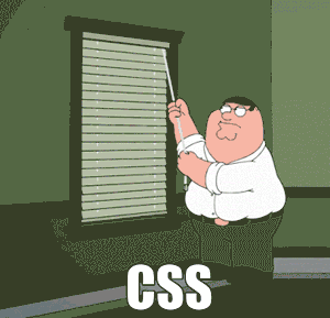
The following GIF shows how a CSS position sticky element looks:
The above GIF contains a CSS position sticky element which is the heading of the document: Do You Know All About Sticky Element? You can see that while I scroll the document, it still sticks to the viewport.
How To Create A Position Sticky Element Using CSS?
You need to create position sticky elements to achieve what they call ‘CSS position fixed’. As I have shown you above, a CSS position sticky is always in the website visitor’s viewport. Creating a position sticky element in CSS as I did above is very easy. But you will have to keep two things in mind:
Declaring the position value as sticky for the element.
Defining a relative value (also called the threshold value).
How To Design A CSS Sticky Header?
A sticky header can be used to stick the heading of a paragraph to the browser window. So, if the paragraph changes and so does it’s heading, a new heading sticks to the browser until the user scrolls the complete paragraph. The following code has been used to create a sticky header:
<!DOCTYPE HTML>

    <head>
    <title>Sticky Element </title>
    <style>
    #sticky-div {
       position : sticky;
        top :0;
      font-size: 30px;
      color: white;
      background-color:  #3991bd;
    }

    p {

      font-size: 20px;
    }

    #description {

    background-color: #6ccde6;
    width : 75%
    }

    </style>

    </head>


    <body style = "background-color: #3991bd">


    <center>
    <h1 id="sticky-div">Introduction To Sticky Elements In CSS </h1>
    <p id = "description">
    <br><br>
    “Your Text”
    <br><br>
    </p>
    <h1 id="sticky-div">
    What is Sticky position?
    </h2>
    <br><br>

    <p id = "description">
    “Your Text”
    </p>
    <br><br>
    <p id = "description">
    “Your Text”
    </p>
    </body>
    </html>
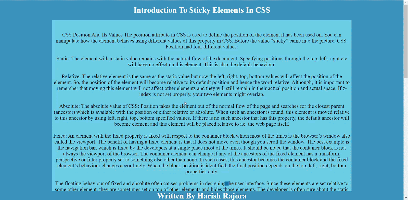
In the code above, I have made the element sticky with the id = ”sticky-div”. In the styling part, to make this element sticky, I have given top:0 because I don’t want any gap between the sticky element and viewport boundary.
Position: sticky specifies that I need to have this element as sticky. With these two parameters, you can make your element or CSS position sticky in no time. The above-coded web page looks as follows:
How To Design A Sticky Footer In CSS?
Footer on a website is a great way to catch the eye of the users on something that you want them to see every time they load the website and even without scrolling. In the below example, consider an article where I want the author’s name to be visible all the time. You can use the same code that we have used above with a slight adjustment to make the heading as a footer.
<style>
    #sticky-div {
       position : sticky;
     bottom:0;
      font-size: 30px;
      color: white;
      background-color:  #3991bd;
    }
The footer will look as follows:
Did you know? The DragnDrop JavaScript library is a light, easy to use drag and drop solution for your website. It allows users to drag and drop elements from one place to another on the page, without disturbing a page’s layout.
How To Design A Sticky Image In CSS?
Sometimes, we want to describe something along with an image that is relevant to the description. But while scrolling, we lose the image and just the text remains. If the text is describing the image, its meaning or its details, the users might be forced to scroll up and down repeatedly to look at the image and then look at the text. This is annoying for a user and is considered as a bad development practice on the developer’s part.
Can we adjust something with the CSS position stick to change the user’s experience in such situations?
Make the following adjustments in the above code:
<style>
    #sticky-div {
       position : sticky;
     top : 0;
      font-size: 30px;
      color: white;
      background-color:  #3991bd;
      width: 150px;
      height: 150px;
    }

    </style>
How To Design A Sticky Navigation Bar In CSS?
Navigation bars are applied on a webpage to ease out the navigation process for the user. But, if your page is too long, and once the user reaches the end, they have to come back to the top to reach the navigation bar and click the links on it. This is not a smooth design keeping in mind the user’s perspective. Using our CSS position sticky knowledge, we can create sticky navbars that stick to the screen so that the user won’t have to scroll back to the top.
<!DOCTYPE HTML>
<head>
<title>Sticky Element </title>
<meta name="viewport" content="width=device-width, initial-scale=1">
<link rel="stylesheet" href="https://maxcdn.bootstrapcdn.com/bootstrap/3.4.1/css/bootstrap.min.css">
<script src="https://ajax.googleapis.com/ajax/libs/jquery/3.5.1/jquery.min.js"></script>
<script src="https://maxcdn.bootstrapcdn.com/bootstrap/3.4.1/js/bootstrap.min.js"></script>
<style>
.navbar {
position : sticky;
top : 0;
background-color: #32839c;
}
.active a {
color : black;
}
p {
font-size: 20px;
}
</style>
</head>
<body style = "background-color: #3991bd">
<center>
<h1>Welcome To InfoWiki </h1>
<br><br>
<nav class="navbar navbar-default">
<div class="container-fluid">
<div class="navbar-header">
<a class="navbar-brand" href="#">Info-Wiki</a>
</div>
<ul class="nav navbar-nav">
<li class="active"><a href="#" style="color: black">Home</a></li>
<li><a href="#what" style="color: black">What</a></li>
<li><a href="#distance" style="color: black" >Distance</a></li>
<li><a href="#author" style="color: black">Author</a></li>
</ul>
</div>
</nav>
<br>
<br>
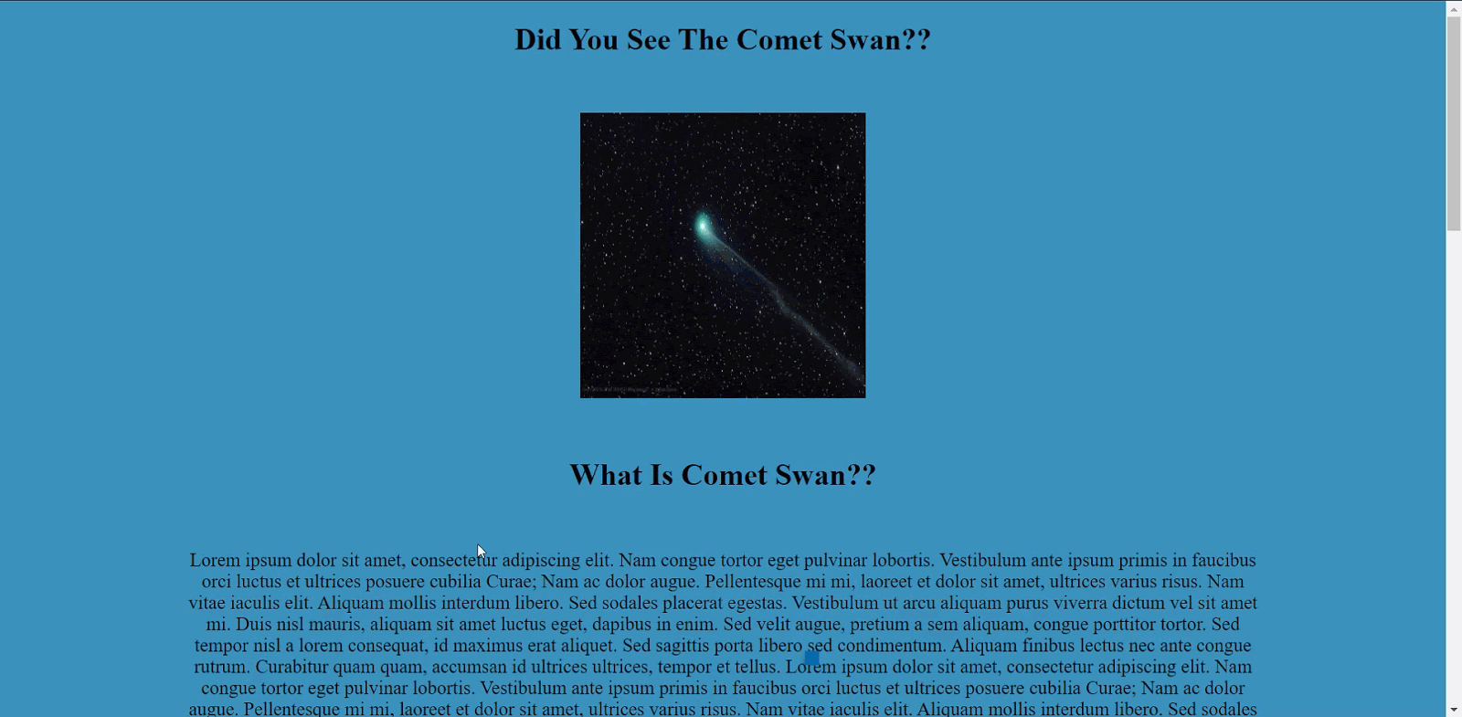
<h1>Comet Swan</h1>
<br>
<img src="Comet_Swan.jpg" width="300px" height="300px" />
<br><br><br>
<h1 id="what">What Is Comet Swan??</h1>
<br>
<p>
“Your Text”
</p>
<h1 id="distance">
How Far Is Comet Swan?
</h1>
<br>
<p>
“Your Text”
</p>
<br><br>
<h1>
How To See Comet Swan?
</h1>
<br><br>
<p>
“Your Text”
</p>
<br><br>
<h3 id="author">Written By Harish Rajora</h3>
</center>
</body>
</html>
It will look as follows:
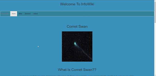
The navbar class has been made a sticky in the above code.
Remember that if you are on a Safari browser then you have to add position: -webkit-sticky along with the code written above. But, if still, your CSS sticky element does not work, I am sure you might have fallen to the special case that I have discussed below.
Special Case With CSS Position Sticky
While working on a few websites when I discovered the CSS position sticky behavior, I often encountered a hidden problem. The problem with my position sticky was that even though I specified the position and threshold, sticky won’t work!
I have seen a lot of developers commit these mistakes (even experienced ones) and the internet is filled with such questions. It is absolutely essential to note that if the CSS sticky element has a parent container and that parent has a property overflow: hidden, then the stickiness won’t work. To make the sticky work or to get your CSS position fixed in such cases, you need to either give another value to the overflow or remove the overflow property completely.
Precedence In CSS Position Sticky
A quick question might pop-up in a web developer’s mind about the precedence of the position that the sticky element takes. For example, what if I specify a top threshold as well as a bottom one? The element can’t stick to both ends, right? So, how do things work out?
When such cases arise, the CSS sticky follows the precedence rule in order to give preference to one threshold value amongst the specified. The precedence rule is as follows:
If the developer has specified both the top and bottom values, top values win.
If the developer has specified both the left and right values then:
Left wins if the direction specified is ltr (left to right).
Right wins if the direction specified is rtl (right to left).
Direction here refers to the writing direction like Arabic is rtl (right to left) while English is ltr (left to right). You can visit CSS Writing Modes for cross browser compatibility to learn more about that.
Accessibility Issues With CSS Position Sticky
If we think for one second how to get CSS position fixed then it would not be too hard to conclude that our browser has to do a lot of work when something is “sticky”. When the user scrolls the window, the fixed or the sticky element has to be repainted onto the screen every time. Although it looks as if the element is stuck onto the window, in reality, the browser has to paint it again and again with respect to the scenarios (like different text scrolling behind the headings). If the browser fails in its speed here, then the element would look a little distorted. The problem here is with people with accessibility concerns like sensitivity issues.
We can help from our side though. To render any element in its own layer and improve the repaint speed we can add will-change : transform along with the sticky properties.
Cross Browser Compatibility For CSS Position Sticky
The current browser support for CSS Position: sticky is really great. All the major browsers support position sticky elements except for Internet Explorer and Opera Mini.
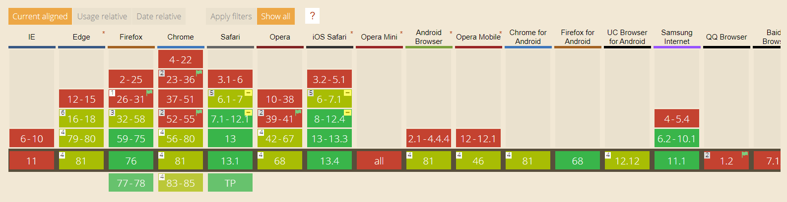
If you notice the above image, although currently, all the browsers support this feature, the support came too late considering the basic design implementation it provides. For example, Google Chrome supports it from version 56, Firefox from 59, and so on. This makes us wonder, how common is CSS position sticky on the web?
Why Don’t We Use CSS Position Sticky That Much?
Looking at what CSS sticky has to offer in web development, they are used considerably less by the web developers today and I am not counting the big firms or established platforms with dedicated teams. The CSS sticky came at the right time on the internet but the browser support or cross browser compatibility for it came too late. Seeing no cross browser compatibility, developers didn’t want to use it on their websites and projects.
Till the time the major browser rolled out their updates with CSS sticky support, it was out of the race. Being in the sand for so long made developers forget about it. On the other hand, stickiness does sometimes behaves inappropriately as in the case of overflow property. But, on the positive side, stickiness has started to turn up on many websites even though the number is too small. Also, it helps a lot in getting your CSS position fixed. I hope to see it gain speed in a couple of years.
How To Run CSS Position Sticky On Internet Explorer?
Internet Explorer has never supported the CSS sticky property and it never will since it has been deprecated (the death of IE). But, as a web developer, I cannot publish my website ignoring the Internet Explorer browser as it is still used by many people. To use the CSS position sticky property, I have to use some turnarounds.
- Negative Margins For Footer : To place the footers on the website, negative margin-top property can be used:
#footer {
     height: 20px;
     Margin-top : -50px;

    }
Flex-box can be used to avoid specifying the height of the footer as in the negative margins. The developer can use the property of the flex-box with different combinations on different container elements to place the element sticky.
Grid: CSS grids can also be used along with the position value fixed to stick it on the viewport.
JavaScript: You can go ahead with the old javascript methods that were used before the introduction of the sticky position.
Do you know what form-attribute does? It associates input and submit buttons with a form to prevent the original page from submitting the data.
Conclusion
*](https://cdn-images-1.medium.com/max/2000/1*P4VkYTf_9ll582adxi0Gxw.png)
CSS position sticky gives us something that the developers have been using for too long but with too much trouble. Although the sticky property came a long time back, it did not get much appreciation from the browsers. Even if it did help in getting the CSS position fixed as well. The most frequently used browser in the world, Google Chrome, provided support for CSS sticky as late as 2017 i.e. 4 years after Safari gave its support. So, if I take Google Chrome as a reference, I find the CSS position sticky a fairly new property (just from the usage point of view). Seeing this, the web developers have not been using it on their website in the past but, this trend is changing now.
The sticky position is taking up pace in the market and with good new designs, it is used in very innovative ways. CSS position sticky also uses GPU to provide better accessibility for the people who need it which, in turn, requires a lot of machine power at times. Unfortunately, not everyone has the ability to set up their own GPU’s to use CSS position sticky for cross browser compatibility. Fortunately, LambdaTest does just the same by letting you perform cross browser compatibility testing over the cloud. With LambdaTest, you will be able to create CSS position sticky and test the element’s cross browser compatibility over 3000+ browsers and operating systems.
In this post, I have taken you to the depth of CSS sticky with some special cases and concerns. While I wrap this post up here, I would be glad to see some comments on your experience with the sticky property of CSS positions and how this post helped you in getting CSS position fixed.