I was recently working on a freelance web development project where I had to develop a website in Mandarin. The unique style of Mandarin blew me away. Mandarin is written vertically and read from right to left. It was different for me and unique in its way. And as a web developer, I was perplexed about the code to write such a language and present it using HTML. As I delivered the website to my client, I thought of sharing what I learned. In this post, I will be sharing how you can leverage CSS writing modes for a cross browser compatible website.
But, before we get down to the property, it is better to understand what is a ‘block’ and ‘inline’ in CSS.
Blocks And Inline In CSS for Cross Browser Compatibility
In the earlier days, CSS elements were categorized as either block-level elements or inline elements. A block-level element is called a “block” because it occupies the complete space (width) of the parent and it seems like a block is created. Although when there is no parent, complete width is taken as the block element width. A block element in CSS starts from a new line to its parent’s entire width. Some of the block-level elements in CSS are “< paragraph >”, “< div >”, “< hr >” etc. The following image shows the block element and the width is shown through the background color.

example of block elements.
<!DOCTYPE HTML>
<head>
<title>block and inline elements</title>
</head>
<style>
p {
 font-size: 48px;
 color: white;
};
</style>
<body>
<p style="background-color:blue">Hello</p>
<p style="background-color:red">Bye</p>
</body>

</html>
Now, Inline elements do not take the entire width of the parent or the page. Instead, inline elements just take the width until the tag is specified. This will be clear from the below image.
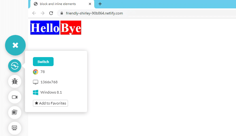
As seen, the background-colour is only till the point the tag is defined and not further away. Since I did not use the < br > tag, it would have been side by side since space is taken only till the point tag is defined. Here is the code for it:
<!DOCTYPE HTML>
<head>
<title>block and inline elements</title>
</head>
<style>
b {
 font-size: 48px;
 color: white;
};
</style>
<body>
<b style="background-color:blue">Hello</b>
<b style="background-color:red">Bye</b>
</body>

</html>
Now that the inline and block concepts in CSS are clear, let’s see what CSS writing modes.
This Playwright automation tutorial will guide you through the setup of the Playwright framework, which will enable you to write end-to-end tests for your future projects.
What Are CSS Writing Modes?
CSS Writing modes is a property of Cascading Style Sheets to define the orientation of the text that has to be written on the web page. Taking the examples of languages only, some languages are written in a horizontal way like English here, and some are written in a vertical way like traditional Japanese or Mandarin.
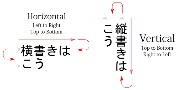
Courtesy: JapaneseWithAnime
If I talk about it in technical terms, then CSS writing modes changes the flow of the block elements in the website. So, if the block element was horizontal first and it was taking up space horizontally, applying writing mode will change the block element to vertical taking up space vertically.
Not only languages but the CSS writing-mode property can also be used at numerous other places such as styling the content or some special need of the website etc. Here is a quick example of how CSS writing modes allow you to play with the content over your website.
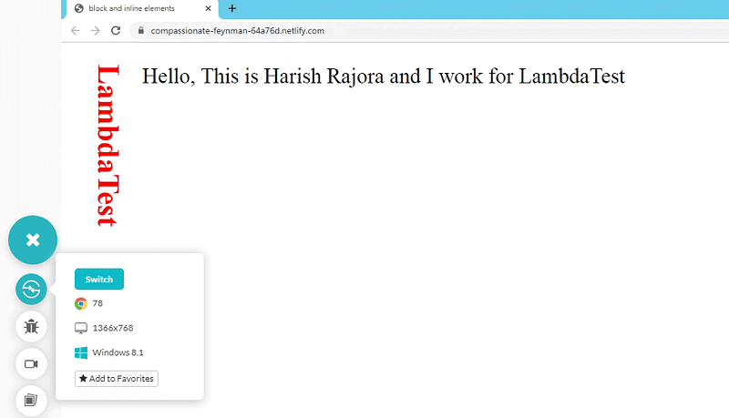
<!DOCTYPE HTML>
<head>
<title>block and inline elements</title>
</head>
<style>
h2 {
 font-size: 48px;
 color: red;
}
p {
 font-size: 34px;
 color: black;
};
</style>
<body>
<div style="position:relative">
<h2 style="writing-mode:vertical-rl; position:absolute; color:red">LambdaTest</h2>
<p style="padding-left:120px">Hello, This is Harish Rajora and I work for LambdaTest</p>
</div>
</body>
</html>
</html>
</html>
Not only the direction of the text seen, but the direction of the text written and read is also defined through CSS writing modes. Like Arabic is read from right to left, so the direction of writing is right to left. Writing-modes in CSS are used majorly for the purpose of depicting the languages which are written vertically but it does not confine to just that. Since there is no defined reason for any property to use in CSS, you can use it whenever you feel the need to do so.
Since it becomes an exhaustive task to verify the CSS & JavaScript of a website over a variety of browsers. To ease the effort, you can use LambdaTest, a cross browser testing platform.
What is LambdaTest?
LambdaTest is a cloud-based browser compatibility testing tool. More than 150,000 testers and developers carry out cross browser testing in 2000+ real browsers, browser versions, and operating systems. You can perform live-interactive testing for manual cross browser testing or you could leverage our Selenium Grid to help you perform automated browser testing of your website.
Other than cross browser testing, LambdaTest can also help you with:
Responsive testing
Automated bulk screenshot testing across different browsers
Visual regression testing for a pixel to pixel comparison
You can fasttrack your test cycles with LambdaTest integrations to 3rd party tools for CI/CD, project management, bug-tracking.

RUN AUTOMATION SCRIPTS ON SELENIUM GRID
2000+ BROWSERS AND OS
With that said, let’s now gaze into different types of CSS writing-modes.
Types Of CSS Writing Modes
Types Of CSS Writing Modes
Vertical-rl
Vertical-lr
Horizontal-tb
Sideways-rl
Sideways-lr
Vertical-rl
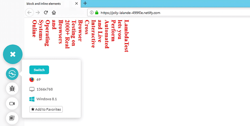
Vertical-rl means the flow of text direction will be vertical i.e. top to bottom and the reading/ writing direction would be right to left. Remember that the next line that will be printed will be to the left of the previous line in this method.
<!DOCTYPE HTML>
<head>
<title>block and inline elements</title>
</head>

<body>
<div style="position:relative">
<h2 style="writing-mode:vertical-rl; position:absolute; color:red">LambdaTest lets you Perform Automated and Live Interactive Cross Browser Testing on 2000+ Real Browsers and Operating Systems Online

</h2>
</div>
</body>

</html>
Vertical-lr
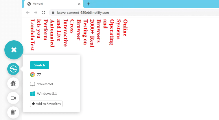
Vertical-lr means the flow of text direction will be vertical i.e. top to bottom and the reading/ writing direction would be left to right. Remember that the next line that will be printed will be to the right of the previous line in this method.
<!DOCTYPE HTML>
<head>
<title>block and inline elements</title>
</head>

<body>
<div style="position:relative">
<h2 style="writing-mode:vertical-lr; position:absolute; color:red">LambdaTest lets you Perform Automated and Live Interactive Cross Browser Testing on 2000+ Real Browsers and Operating Systems Online

</h2>
</div>
</body>

</html>
For the people with Sherlock Syndrome, you may have noticed that the only change that took place between the Vertical-rl & Vertical-lr is in the heading tag where we specified the writing mode. I thought of providing a full piece of code so you can easily copy and paste for a quick check.
Horizontal-tb
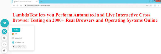
Horizontal-tb means the flow of block will be top to bottom (every new line) as well as of text. The reading/ writing direction would be left to right. This is the default value and if you have not applied a class specifically with any other writing-method, there is no need to mention this type of method especially.
Google Chrome 77
<!DOCTYPE HTML>
<head>
<title>block and inline elements</title>
</head>
<style>
h2 {
 font-size: 48px;
 color: white;
};
</style>
<body>
<div style="position:relative">
<h2 style="writing-mode:horizontal-tb; position:absolute; color:red">LambdaTest lets you Perform Automated and Live Interactive Cross Browser Testing on 2000+ Real Browsers and Operating Systems Online

</h2>
</div>
</body>

</html>
Sideways-lr
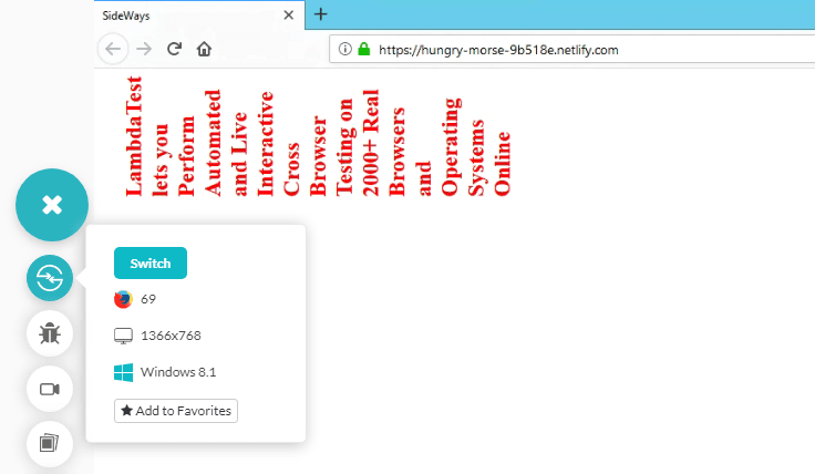
Sideways-lr property in writing mode has a block flow direction from left to right. The text is written vertically but the next line comes right of the first line. Notice the orientation of the word LambdaTest (and every other word) in vertical-lr and sideways-lr. They are opposite to each other.
Firefox 69
<!DOCTYPE HTML>
<head>
<title>block and inline elements</title>
</head>
<body>
<div style="position:relative">
<h2 style="writing-mode:sideways-lr; position:absolute; color:red">LambdaTest lets you Perform Automated and Live Interactive Cross Browser Testing on 2000+ Real Browsers and Operating Systems Online

</h2>
</div>
</body>
</html>
Sideways-rl
Sideways-rl property in writing mode has a block flow direction from right to left. The text is written vertically but the next line comes left of the first line.
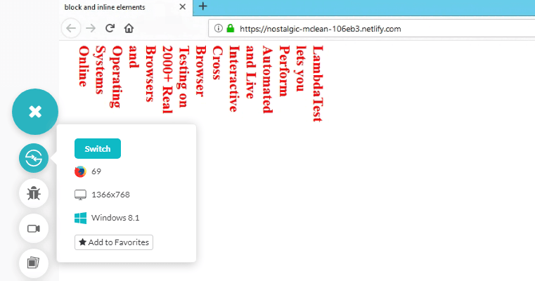
Sideways Property In Firefox 69
<!DOCTYPE HTML>
<head>
<title>block and inline elements</title>
</head>

<body>
<div style="position:relative">
<h2 style="writing-mode:sideways-rl; position:absolute; color:red">LambdaTest lets you Perform Automated and Live Interactive Cross Browser Testing on 2000+ Real Browsers and Operating Systems Online

</h2>
</div>
</body>
</html>
Cross Browser Compatibility Of CSS-Writing Modes
Now, that we are aware of the different types of CSS writing modes. You may be wondering about their cross browser compatibility?! Do they render seamlessly across different browsers? Or Do they end up with cross browser compatibility issues? Let’s find out!
As we know so far, CSS writing-mode property can take different values. The cross browser compatibility of CSS writing mode property depends upon how you are trying to incorporate it into your website or web-application. Are you leveraging it for vertical & horizontal, or are you trying to accomplish the sideways rendering through the CSS writing mode property.
Browser Compatibility For Vertical & Horizontal CSS Writing Mode
If you are trying to leverage the CSS writing mode property for rendering your text in vertical or horizontal manner then you may not have to worry too much about the cross browser compatibility issues if your focus is over the latest browsers only. However, if you dig into your web-analytics and find out that you are having a significant number of visitors from the legacy browser version then your website may be failing for that audience.
You can check the same by using caniuse. It is thus vital to have contingency plans for such unsupported browsers to ease the cross browser testing effort.
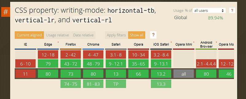
Although CSS writing mode is supported by all the latest versions of major browsers like Google Chrome, Mozilla Firefox, Safari, Opera, and more. There are cross browser compatibility issues over the legacy versions of these browsers.
The all new chromium-based Edge browser is now supporting vertical-lr, vertical-rl & horizontal-tb property for CSS writing mode. Not to forget the notorious Internet Explorer won’t support the CSS writing modes as it doesn’t get any updates from Microsoft anymore. You can read more about it from my article over the death of IE.
Death Of IE; Its Aftermath On Cross Browser Compatibility
Now, what happens if we try to view our above piece of code in unsupported browsers?
Browser Incompatibility of Vertical-rl in Edge 16
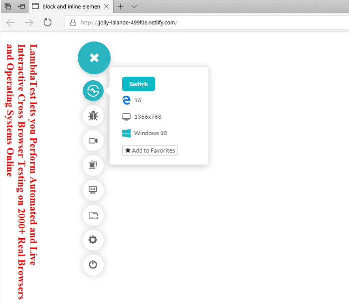
The above image shows Microsoft Edge not supporting the property. Now, the text is being rendered vertically but it isn’t rendering from right to left as it did for Firefox 69.
Browser Incompatibility of Vertical-lr In Mozilla Firefox 40
Well, let us have a look at the sibling property vertical-lr in a legacy browser. We will take Mozilla Firefox 40 and see what happens there.! As we noticed in the CanIUse image, Mozille Firefox version 2–42 do not support the vertical-lr property for CSS writing modes.

Vertical-lr writing mode in Firefox 40
Clearly, the text is not rendering vertically so if your website visitors are coming from older browser versions then your website may fail to impress them by not rendering the text vertically, as per your design.
Care to know how you can fix these incompatibilities for vertical text orientation? Follow our article.
Why Vertical Text Orientation Is A Nightmare For Cross Browser Compatibility?
What About Browser Incompatibility of Horizontal-tb?
Well, horizontal-tb is the default writing-mode in CSS. Since this is the default value, even if it is not supported inside your browser, you would probably not tell any difference, neither will it make any difference to your customers. So even though the legacy browser versions and IE doesn’t support this property, it won’t make a dent over your website’s reputation over the internet.
This Playwright automation testing tutorial will guide you through the setup of the Playwright framework, which will enable you to write end-to-end tests for your future projects: lambdatest.com/blog/playwright-framework
Browser Compatibility For Sideways CSS Writing Mode
If you are trying to leverage CSS writing modes sideways then you are in for a cross browser compatibility mess! Why? Well, so far the sideways-rl & sideways-lr are only supported by the latest Mozilla Firefox browsers.
Browser Incompatibility of Sideways-lr In Google Chrome 72
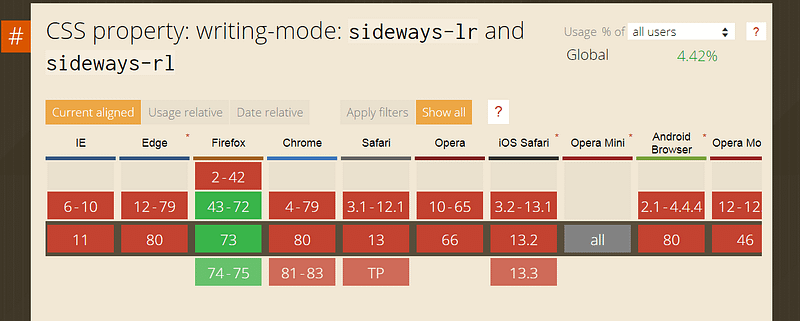
Rest of the browsers have not yet implemented the support for this property and haven’t shared any update on when they might. After performing cross browser testing, we can ensure that the CanIUse table represented above holds correctly with respect to sideways-lr implementation on multiple browsers.

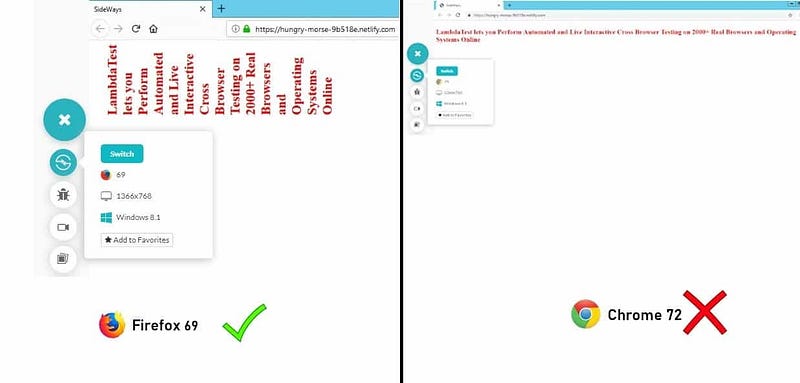
Snapshot of Sideways-LR in Google Chrome version 72
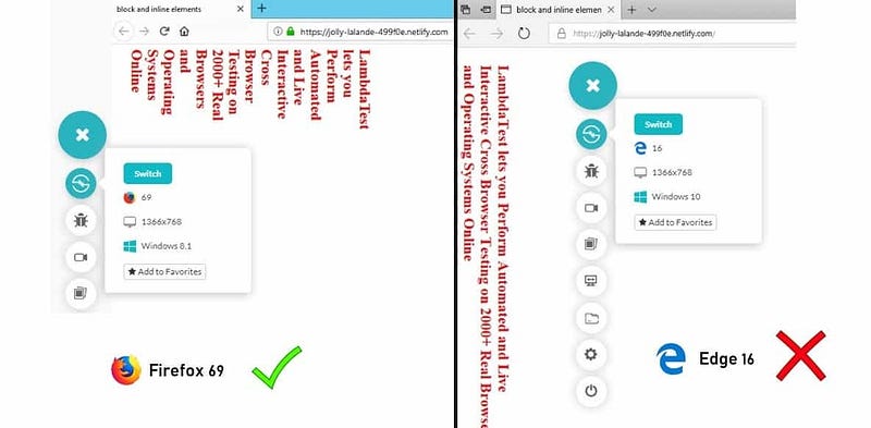
Here is a comparison image to illustrate the difference between the supported browser & unsupported browser for the CSS writing mode property of sideways-lr.
Browser Incompatibility of Sideways-rl In Google Chrome 77

Sideways property in Google Chrome 77
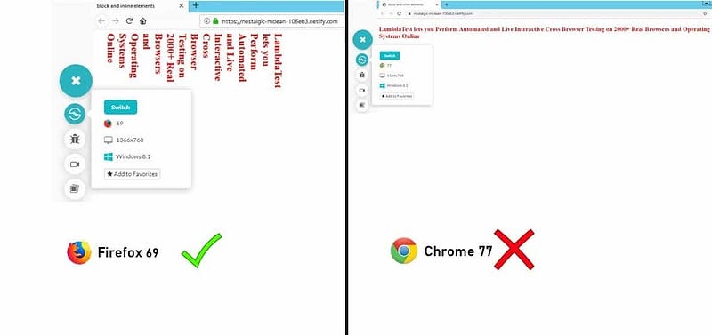
Similarly for sideways-rl, the text is not rendering as it should. Even in Google Chrome browser which is the favourite browser by the majority of internet users, the property continues to create a cross browser compatibility issue. Which is the second favourite browser you ask? Read about it in our article.
Which Browsers Are Important For Your Cross Browser Testing?
Here is a comparison image between the Mozilla Firefox & the Google Chrome browser to demonstrate the cross browser compatibility difference.
To view and understand all these writing-mode properties, there is no need to install specific browsers (such as Firefox for sideways). You can always go for a cloud-based cross browser testing platform such as LambdaTest which are cheaper and saves a great deal on time. Through such platforms, it is very easy to check cross browser compatibility in case you are going to use any of the properties above.
This Playwright browser testing tutorial will guide you through the setup of the Playwright framework, which will enable you to write end-to-end tests for your future projects: lambdatest.com/blog/playwright-framework
Wrapping it up
CSS writing-modes turned out to be the right solution to the problem I had. As I said in the beginning, I was perplexed about the code I would have to use to write Mandarin on a web page. I am not anymore.!
I am sure by far you too must have had a pretty good idea about implementing CSS writing-modes for your website or web-application. You may use it for typography tips or to develop a website in a particular language.
You also know the browsers that might fail to render the website as intended due to the lack of cross browser support for CSS writing modes. In such cases, it is recommended that you create an external css code such as transform to rotate the text deliberately.
Remember, whether you incorporate the writing-modes property or not. You might never know what bugs you might land over your website till you actually test. Only after you test, can you confirm whether your fallbacks are working for unsupported browsers. So make sure you never miss out on cross browser testing. It is the key to a never-failing customer experience through a robust UI. That was all from this LambdaTest Experiment, see you in the next one! Happy testing.! 🙂cc
