

![The Complete CSS Animations Tutorial [With Examples]](https://cdn.hashnode.com/res/hashnode/image/upload/v1655283103516/COrTgDDfQ.jpg?w=1600&h=840&fit=crop&crop=entropy&auto=compress,format&format=webp)


Table of contents
- What Are CSS Animations?
- But Primarily Are Your CSS Animations Responsive?
- CSS Animations — Transformations
- Translate
- Scale
- Rotate
- Skew
- Browser Compatibility For CSS transform
- CSS Animations — Transitions
- transition-property In CSS Transitions
- transition-duration In CSS Transitions
- transition-timing-function In CSS Transitions
- transition-delay In CSS Transitions
- Browser Support for CSS Transitions
- CSS Animations — Keyframes
- Using CSS keyframes Using from-to Keywords
- Using CSS keyframes Using Percentages
- CSS Animation And Its Sub Properties
- animation-name
- animation-duration
- animation-timing-function
- animation-delay
- animation-iteration-count
- animation-direction
- animation-fill-mode
- animation-play-state
- CSS Animation Shorthand Property
- Browser Support For Animation Property
- That’s All!
Animation can bring creativity, enthusiasm, grab the user’s attention, convey things quickly, and improve usability. Recently, there has been a rise in the use of animation on websites and web apps. CSS Animations are an excellent way to create visual animations that are not restricted to a single motion like CSS Transitions but are far more developed. With that thought in mind, CSS developers thought of introducing them to their library as CSS Animations.
Indeed, we can build some stunning animations using JavaScript and jQuery, but this is an expensive approach. For example, processing speed, cross browser compatibility, and code complexity are considered when designing animated UI.
](https://cdn-images-1.medium.com/max/2000/1*fwBrqTgK5pLGshJTyjxgDA.gif)
In this CSS Animations tutorial, we will learn the concept of CSS animations and break the animation down into smaller units to understand the underlying concept. Later, we would make animations and run them on the web page.
Let’s begin with our CSS Animations tutorial!
Did you know? rem (root em) units shows a browser compatibility score of 100.
What Are CSS Animations?
CSS Animation is the process of animating the objects (or elements) on a web page. Earlier to CSS Animations, it was done with the help of JavaScript and its libraries which as a developer, you would know that it unnecessarily complicated the matters. CSS Animations bring pre-defined properties that are easier to apply and faster to establish the end-goals with multiple options packed inside it.

Moving the animations to CSS provides better performance than JavaScript as the browser takes control and optimizes the animation for the performance. The properties that come with the CSS animations can be divided into three major categories:
Transformation — Transforming the dimensions, rescaling the objects, moving them from point A to B, etc.
Transitions — Performing the transformations smoothly.
Keyframes — Changing the animation (property, value, etc.) at a given time or state.
Once we have implemented the above three properties, we are done with the CSS animations. In this CSS Animations tutorial, we look at each one of them with relevant examples on CSS Animations.
But Primarily Are Your CSS Animations Responsive?
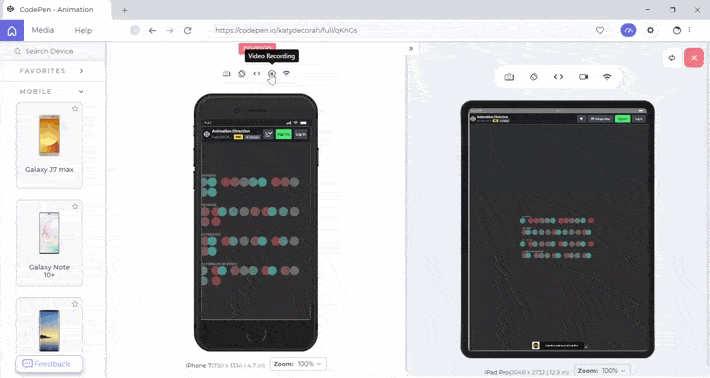
In this CSS Animations tutorial, we will learn how to create animations and incorporate them in websites and web pages. However, when we create animations, we want them to be compatible with a multitude of screen sizes like smartphones, tablets, desktops, laptops, etc. In order to build a responsive web design with animations, we must perform a responsiveness test using a responsive web checker tool.
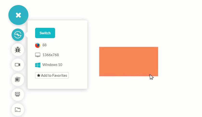
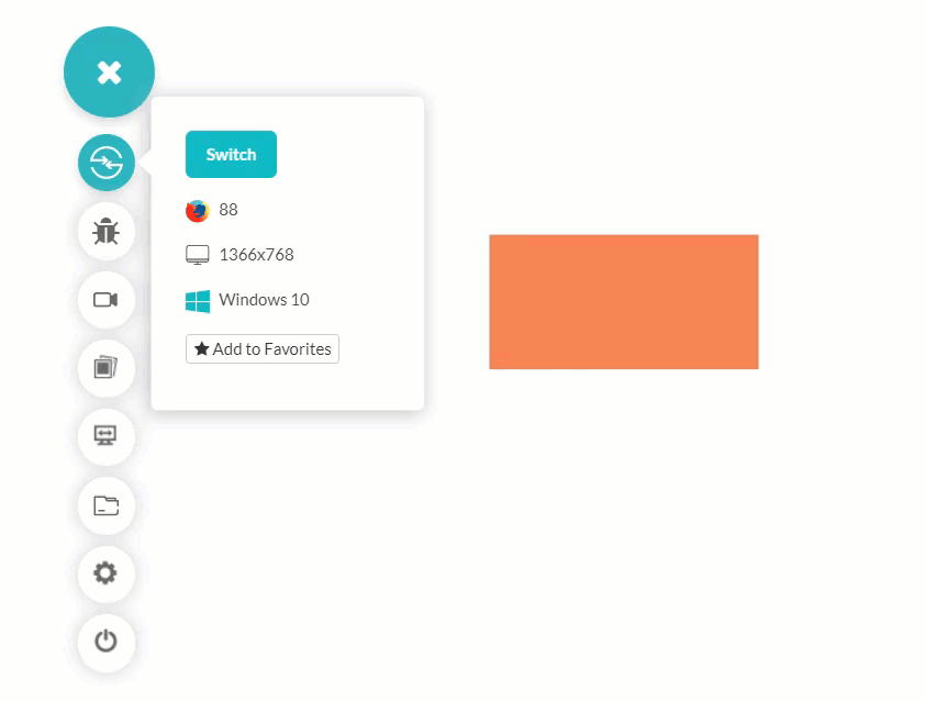
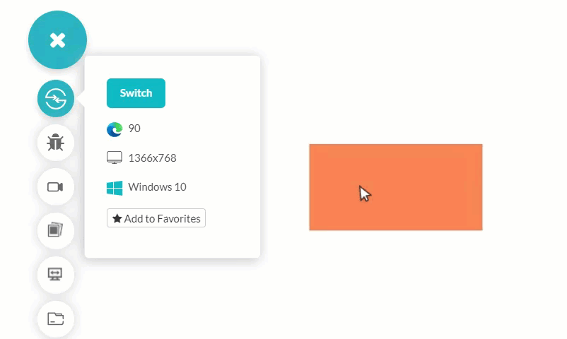
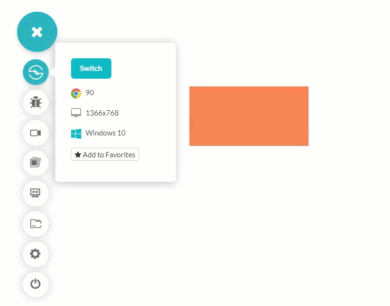
Frequently testing responsiveness with manual techniques can be cumbersome and expensive. Therefore, you should invest in robust and free responsive web checker tools like LT Browser to save time and quickly test web designs. With LT Browser you can perform mobile view debugging across 50+ pre-built device viewports, create custom device resolutions, network simulation, hot reloading, generate performance reports powered by Google Lighthouse, and much more.
Let’s access the responsiveness of the animation-direction property in LT Browser on mobile and tablet viewports.
CSS Animations — Transformations
The transform property in CSS animation makes transformations to the size (rescaling), moving them (translating), rotating them (rotations) or skewing them on the web page. The CSS transform requires four types of values:
none: To define that no transformation is intended on the object.
value: To assign a value such as rotate.
inherit: Inherit the property from the parent element.
initial: Set the value as the default value for the property assigned to the object.
The “value” part defined in the above pointer determines what we want to do with the object. You can replace the value with one of the four options:
Translate
The “translate” value is used to move the object from point A to point B. The translation can happen either on the X-axis or the Y-axis.
Syntax:
transform: translate_option(values);
Here are ethe translate options are as follows provide by CSS animations:
- translate(value): To translate only along the X-axis.

translate(value, value): To translate along the X and Y axis.
translateX(value): To translate along the X axis.
translateY(value): To translate along the Y axis.
You can use the following common code and use syntax to replace the values.
<html lang="en" dir="ltr">
        <head>
          <meta charset="utf-8">
          <title>Flexbox demo</title>
          <style>
            .transform_animation {
              width: 200px;
              height: 100px;
              margin-top:200px;
              background-color: rgb(235, 122, 84);
            }

    .transform_animation:hover {
              transform: translate(100px, 100px);
            }

    </style>
        </head>
        <body>
            <br>
      <center>
                <div class = "transform_animation">
                </div>
        </center>
        </body>
      </html>
The “value” can also take negative values that would move in the opposite direction (i.e. along the negative X and Y-axis).
Scale
The next value that the transform property takes in CSS animations is “scale”. With the “scale” property, the object’s dimension can be scaled up or down without changing it’s coordinates.
Syntax:
transform: scaling_option(values);
The scaling options are similar to the translate option and provide the following values:
scale(value, value): To scale the object along X-axis and Y-axis.
scale(value): To take a single value and scale the object to X-axis and Y-axis as per the value.
scaleX(value): To scale the object on the X-axis only.
scaleY(value): To scale the object on the Y-axis only.
Unlike translate, we cannot specify the “px” value in the scale function. Instead, we need to specify the scaling factor by which we want to expand or shrink the current dimensions. For example, a scaling factor of 2 would expand the dimension to twice the current value. A scaling factor of 0.5 would shrink the dimensions to half the current value.
The following code will scale the dimensions to twice the size.
 .transform_animation:hover {
              transform: scale(2,2);
            }
The rest of the code remains the same as described in the above section (Translate).
Output:
You can also try other values and check their outputs.
Rotate
Another transform attribute is “rotate” which works on the object’s rotation to the specified angle. The angle in “rotate” is specified in either degrees, gradians, radians, or turns. The unit chosen by the user has to be specified along with the numerical number. For example, rotate(30deg) for degrees etc. The rotate function comes with similar functions as follows:
rotate(angle): To rotate the object at “angle” degrees.
rotateX(angle): To rotate the object at “angle” degrees along the X-axis.
rotateY(angle): To rotate the object at “angle” degrees along the Y-axis.
We have changed the code in the above section to realize rotation of the object at 75 degrees.
Syntax:
 .transform_animation:hover {
              transform: rotate(75deg);
            }
Output:
The following output will be seen when we rotate the same object at 75 degrees along the X-axis.
Output:
Skew
The final transformation in CSS animations is the “skew” attribute. The word “skew” refers to being slanted in English and performs the same job in CSS. The skew function comes in the following variations:
skew(X, Y): To skew the object at an angle X on the X-axis and Y on the Y-axis.
skewX(X): To skew the object at an angle X on the X-axis.
skewY(Y): To skew the object at an angle Y on the Y-axis.
The following code would skew the object at an angle of 30 degrees on the X-axis and an angle of 30 degrees on the Y-axis.
Syntax:
.transform_animation:hover {
              transform: skew(30deg, 30deg);
            }
The rest of the code remains the same as in previous sections.
Similar to the rotate function, a user can use the angle in their favorite units by specifying the shorthand (such as deg for degrees). We can now end our transformation section and keep these properties in mind to use them later in the CSS Animations tutorial.
Browser Compatibility For CSS transform
The browser compatibility for CSS transform is great and the function is accepted in all the browsers.
](https://cdn-images-1.medium.com/max/2000/1*EKbVi7xWgFBJGfORVqlghw.png)
So, you can go ahead and transform a few objects on the web page without worrying about cross-browser compatibility issues.
CSS Animations — Transitions
In the above section about the transformations in CSS Animations, we achieved the required goal (such as scaling the dimensions and moving objects) but the transition from the starting state to the end state is abrupt as shown in the below image.
Although the skew function is working fine, it looks as if a video with two different images is combined to make an animated video. A slower stop motion animation perhaps is not what we want from CSS animations. An “animation” will look like an “animation” when the transition from the starting state to the end state is smooth. We will achieve this using the transition property in CSS Animations.
The transition feature in CSS comprises of four properties:
transition-property
transition-duration
transition-timing-function
transition-delay
transition-property In CSS Transitions
The transition-property attribute specifies what property needs to apply to the transition. For example, transition-property: width will apply the transitions when there is a change in the width of the elements.
It is important to note that not all properties can be animated and applied in the transition-property section. CSS provides a list of animatable properties and they keep on changing with every version of CSS. Therefore, it is important to check your property in CSS Animations and perform cross browser testing from time to time.
Also, a special case occurs in “transition-property” when the developer uses a shorthand property as a value. For example, transition-property: background is one such property. Here, the background is a shorthand for multiple attributes and sub-properties of background. When such a shorthand is used, the animation is applied to all the sub-properties which are under the segment.
The transition-property takes the following values:
none: To signify that no property should make transitions.
all: To signify all the properties that can transit or should transit.
property_name: The name of the property that you want the transition to take place.
Syntax:
transition-property: property_name;
Hey! Did you know? The text-decoration property is a shorthand, which means it’s short hand for the actual declarations: text-decoration-line, text-decoration-style, and text-decoration-color.
transition-duration In CSS Transitions
The “transition-duration” in CSS tells about the time within which the transition needs to be completed. The more time you specify, the slower the transition will happen. If this property is not defined, the default value of zero is taken into consideration.
Syntax:
transition-property: duration with units;
Let us construct the same web page of skewing the object with “transition-duration”:
 <html lang="en" dir="ltr">
        <head>
          <meta charset="utf-8">
          <title>Flexbox demo</title>
          <style>
            .transform_animation {
              width: 200px;
              height: 100px;
              margin-top:200px;
              background-color: rgb(235, 122, 84);
            }

    .transform_animation:hover {
              transform: skew(30deg, 30deg);
              transition-duration: 2s;
            }

    </style>
        </head>
        <body>
            <br>
      <center>
                <div class = "transform_animation">

    </div>
        </center>
        </body>
      </html>
Output:
In the CSS Transition property, we can also specify multiple values separated by a comma. The same principle can be applied to the transition-duration property as well. But, that has to be calculated properly to match with the property.
If there are two properties and two time-durations, then they match one on one to each other (i.e. the first property will run for the first duration and the second for the other).
If the time durations are lesser in number than the properties, they are repeated to match the number of properties.
If the time durations are more in number than the properties, the extra durations are not considered (and deleted further).
Syntax:
transition-duration: x;
transition-timing-function In CSS Transitions
The third CSS Transition property in CSS animations is the “transition-timing-function” that lets you decide the speed at which the transition should happen. The developer can use various speeds such as slow start, gradual increase in speed, or use a calculated function of their own. To define the transition-timing, it offers the following values:
ease: Start the transition slowly then increase the speed as time passes till the middle of the animation. From the middle point, the animation slows down gradually. The value “ease” is equivalent to the (0.25, 0.1, 0.25, 1) cubic-bezier function.
ease-in: Start the transition slowly and keep on increasing the speed till the end. The value “ease-in” is equivalent to the (0.42, 0, 1 , 1) cubic-bezier function.
ease-out: Start the transition quickly and keep on decreasing the speed till the end. The value “ease-out” is equivalent to the (0, 0, 0.58, 1) cubic-bezier function.
ease-in-out: Start the transition and keep on increasing the speed towards the middle of the animation. From middle to end, the transition keeps on decreasing at a gradual pace. The ease-in-out and functions are similar except that the ease starts slightly slower than it ends.
linear: The transition starts, moves, and ends at the same speed. The value “linear” is equivalent to the (0, 0, 1, 1) cubic-bezier function.
steps(x, jump_term): The steps function performs the CSS transitions in a series of steps. The number of steps to perform is denoted by “x” while jump_term denotes how to divide these steps between 0% to 100% of the CSS transition. The “jump_term” can be replaced with one of the following values:
jump-start: The first jump starts from the beginning of the transition.
jump-end: The last jump ends at the end of the animation/transition.
jump-none: The jump doesn’t happen at both ends of the animation.
jump-both: The value includes pauses at the start as well as end of the animation.
start: This is similar to jump-start.
end: This is similar to jump-end.
step-start: This is equivalent to steps(1, jump_start).
step-end: This is equivalent to steps(1, jump-end).
Use this property as follows:
 .transform_animation:hover {
              transform: skew(30deg, 30deg);
              transition-timing-function: steps(4, jump-end);
              transition-duration: 2s;
            }
Output:

Notice the difference between the skew methods used in the above two functions and how the steps function has changed it.
transition-delay In CSS Transitions
transition-delay is a simple property that defines the wait time before starting the CSS transition. The user needs to define the time units along with numerical values (e.g. 230ms and 2s).
This is the end of CSS Transition properties that provides us with smooth animations.
Browser Support for CSS Transitions
The browser support for CSS Transition is great and all the versions of all the browsers support every sub-property.
](https://cdn-images-1.medium.com/max/2000/1*ktBHi-NnBFwJn5XNohzZCw.png)
The values starting with the “jump” keyword cannot be implemented in Internet Explorer though. Instead, you can use “start” and “end”.
CSS Animations — Keyframes
With this, you would be able to do transformations from point A to point B in a smooth manner. But this is just a single animation we are talking about. We can either choose to expand the width or rotate the object. Doing a single thing will not bring out effective animations that please our eyes. It also challenges the developers!
This is why keyframes were introduced in CSS Animations. It also helps in changing the animations from animation 1 to animation 2 to animation n. On top of it, the developer has the freedom to choose the time (or interval) at which the animation should move from 1 to 2.
There are two ways to achieve the animations using keyframes:
Using from-to keywords
Using the percentage assignment
Let’s look at examples that demonstrate examples of CSS Animations using special scenarios.
Using CSS keyframes Using from-to Keywords
from-to keywords are used to define an animation that will move from “from” animations to the “to” animations.
A simple example is as follows:
from {
                transform: skew(0deg);
            }
            to {
              transform: skew(30deg);
            }
This indicates to the CSS Animation that the object needs to be moved from 0 degrees to 30 degrees.
The only thing missing here is assigning a name to it so that we can call it using CSS or JavaScript. The parser would know the animation that you are interested in. The naming is done with the “@keyframes” keyword (defining that we are defining a keyframe) and a name (also called identifier) after it.
 [@keyframes](http://twitter.com/keyframes) skew_animation {
            from {
                transform: skew(0deg);
            }
            to {
              transform: skew(30deg);
            }
          }
This is a complete definition of a keyframe with the terms from and to.
Using CSS keyframes Using Percentages
Using CSS keyframes with percentages to achieve the animation gives us enough freedom and flexibility in constructing complex animations. The percentage defines the part of animation at which the animation needs to start. For example, 0% means implementation at the start of the transition. While 50% would mean applying certain transformations in the middle.
The following example defines three animations that take place from start to middle, middle to end, and at the end of the transition (i.e. at 100%).
[@keyframes](http://twitter.com/keyframes) skew_animation {
            0% {
                transform: skew(0deg);
            }
            50% {
              transform: skew(30deg);
            }

    100% {
              background-color: cyan;
            }
          }
Once our keyframe is defined, we need to attach it to an object in the HTML so that the parser knows at which place this animation has to be applied. We use the identifier (the keyframe name) to attach it to the object as shown below:
animation-name: skew_animation;
Here is the complete implementation:
 <html lang="en" dir="ltr">
        <head>
          <meta charset="utf-8">
          <title>Flexbox demo</title>
          <style>
            .transform_animation {
              width: 200px;
              height: 100px;
              margin-top:200px;
              background-color: rgb(235, 122, 84);
              animation-duration: 2s;
              animation-name: skew_animation;
            }

    [@keyframes](http://twitter.com/keyframes) skew_animation {
            0% {
                transform: skew(0deg);
            }
            50% {
              transform: skew(30deg);
            }

    100% {
              background-color: cyan;
            }
          }
          </style>
        </head>
        <body>
            <br>
      <center>
                <div class = "transform_animation">

    </div>
        </center>
        </body>
      </html>
Output:
The attribute “animation-duration” can be changed to a higher value if the developer wants to retain the animation for a longer duration.
CSS Animation And Its Sub Properties
In the above section of the CSS Animations tutorial, we applied the animations to an object using various methods. The last section introduced “animation-duration” and “animation-name” that attach these animations to an object. These are the sub-properties of “animation” that can be used for controlling the animation configurations.
Here are different animation properties:
animation-name
The animation-name property defines the name of the animation (the keyframe identifier) that is required to be attached to the object. Multiple animations can be used with comma-separated values.
animation-name: test;
animation-duration
animation-duration property specifies the time of completion of one animation cycle. Negative values are considered as zero in the “animation-duration”.
animation-duration: 4s;
animation-timing-function
Similar to “transition-timing-function”, the “animation-timing-function” works on the complete keyframe (i.e. how the animation should proceed). It takes the same values as defined in the “translation-timing-function”. Please refer to the CSS transition function to know more.
animation-timing-function: linear;
animation-delay
The animation-delay property specifies the time to wait before starting the animation. This property is similar to the “transition-delay” property but it works on the complete animation cycle. The “animation-delay” can also take a negative value but the animation starts immediately for negative delays.
animation-delay: 2s;
animation-iteration-count
The “animation-iteration-count” specifies the number of times the animation should be played before coming to a halt. You can either use a positive integer number or the keyword “infinite” to play animation infinitely.
Decimal positive numbers such as 0.5 are also valid specifying that half of the animation needs to be played. Negative numbers however are not considered valid.
animation-iteration-count: 4;
animation-direction
The “animation-direction” property specifies how the animation should be played when triggered. The “animation-direction” takes the following values:
normal: The animation is played as it should without any changes and returns to the start state after each cycle.
reverse: The animation plays from the end state to the start state (i.e. in reverse).
alternate: The animation moves from normal to reverse every alternate time. So for the first cycle animation is played in the “normal” direction and the next cycle happens in reverse.
alternate-reverse: This is the reverse of the alternate value and the animation moves backward in alternate-reverse.
animation-direction: reverse;
animation-fill-mode
The “animation-fill-mode” is used for applying the style to the element before start of the animation, after the end of the animation, when the animation is not playing, or at the start & end of the animation. The animation-fill-mode takes the following values:
none: This is the default value of “animation-fill-mode” and does not apply any style to the element.
forwards: The last keyframe styles are retained and applied to the element. The last played keyframe depends on the “animation-direction” and the “animation-iteration-count”.
backwards: The first relevant keyframe’s styles are applied to the element. The keyframe depends on the “animation-direction” which is also retained during the “animation-delay” period.
both: The animation styles are applicable in forward and backward direction.
animation-fill-mode: forwards;
animation-play-state
The “animation-play-state” property sets the state of the animation to either running or paused state. When the animation is paused, it resumes from the same point when the state is changed to “running”.
The animation-play-state accepts only two values: “running” and “paused”.
animation-play-state: running;
CSS Animation Shorthand Property
Shorthand properties are a great way to save space and implement all the useful specifications in a single line. You can refer to our earlier blog on CSS Flexbox guide where we demonstrated flex using three different properties. The property “animate” in CSS constitutes the following property:
animation-name
animation-duration
animation-timing-function
animation-delay
animation-iteration-count
animation-direction
animation-fill-mode
animation-play-state
Here is a simple example that demonstrates the usage of animation shorthand:
    .transform_animation {
              width: 200px;
              height: 100px;
              margin-top:200px;
              background-color: rgb(235, 122, 84);
              animation: skew_animation 2s linear 0s 2 normal running;
            }

    [@keyframes](http://twitter.com/keyframes) skew_animation {
            0% {
                transform: skew(0deg);
            }
            50% {
              transform: skew(30deg);
            }

    100% {
              background-color: cyan;
            }
          }
Output:

It is important to specify the “animation-duration” property else the default value ‘0’ is considered. With this, the animation will not start. If the properties are similar for two or more segments, you can combine them with a comma-separated value as follows:
 0%, 100% {
     properties;
    }
    50% {
    properties
    }
Browser Support For Animation Property
Animation property has great support among the browsers.
](https://cdn-images-1.medium.com/max/2000/1*QJKwqqoq5QfwXdQ7bTA3pQ.png)
Since the animation property contains different animation sub-properties, all of them enjoy similar browser support among the browsers.
Hey! Did you know? CSS3 Text-overflow shows a browser compatibility score of 100. The formal definition of Text-overflow is that its not Inherited, it applies to block container elements, its initial value is clip, its animation type is discrete and the computed value is as specified.
That’s All!
CSS Animations are a great way to embed attractive elements onto your web page and improve the user experience. This CSS Animations tutorial highlighted the building blocks of animations in CSS with examples. These are all the things that are required to build an animated browser compatible website and web apps. To perform cross browser compatibility testing of CSS animated websites and web apps, you can try out LambdaTest — a cross browser testing cloud that offers 3000+ browsers and OS combinations to test your websites and web applications for browser compatibility.
](https://cdn-images-1.medium.com/max/2000/1*Mt3Ne9e8YXr0D9kuqq8WEQ.gif)
The possibilities are endless when working with CSS animations. But more ideas give birth to more attractive designs and we welcome all those suggestions from our readers. Comment down below your CSS animation designs and help the developer’s community to enhance their animation skills.
Happy Animation!